
This is part of my Generative AI in the Classroom series where I write about how AI is changing education and what I have learned from using it. Read the rest of this series here.
For the last month, I have been working on different ways to use Midjourney and incorporate it into my Adobe Express designs. As a result, I recreated my Twitter logo. Below, is how I did that process.
First start with a simple portrait photo that has little to no background. If you do have a portrait with a background, start by loading it into Adobe Express and using the remove background function first. If you do not want any graphics on your clothes, be sure to block them out with a color square because MidJourney will reprocess it with random shapes later.
Every time you make a prompt in MJv5, it will produce 4 images. V4 made 4 low res pics but v5 makes them at a higher resolution. As each group is generated, you can then upscale the individual images. Midjourney also keeps them archived in your online profile to go back and use later.


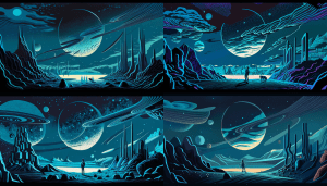
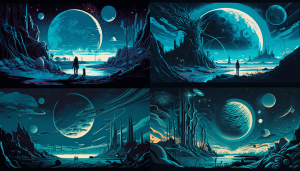
Next, think about what kind of background you might want to go over on your logo and if it’s not already listed inside of Adobe Stock images, think about building it inside a Midjourney. The one I used ended up being one that I generated by using a prompt for a futuristic astronaut on a planet’s surface. I really like the idea of space and space exploration that’s always a theme that’s in a lot of my classes and my blog post so I added it to my logo.
Third, I began building my logo inside of Adobe Express and only used the two images out of Midjourney. I started by building the layers and converting what I had used before in my social media logo template. I decided to rebuild my polygons for my background to get enough of the image outside of the text circle. I really like the idea of the circle square medallions that kind of look like a turtle.
Lastly, as you are making your text circle, make sure you type all of the words into the text box first. By putting a couple of spaces on the first line and the same amount of spaces on a line after your text, it opens up the bottom of your text circle. This gives a nice look to it. It also creates some negative space your inner title, or whatever you might put underneath the profile pic that will be the center of your logo medallion.


You must be logged in to post a comment.